Loading

BLOG

[17 July 2026] - Evolution Of My Site's Layouts
Click To Go Back To The Blog Page

Introduction

Hi!!! This isn't my first entry. I actually wrote a previous entry about a year ago, but I thought it was kinda too personal, over-dramatized and cringe. So instead, I wanted to write about a better subject: How I made this site, its layout and how it evolved. I had nine layouts in total (including the current one), and I'd like to tell you how I've made them one by one.


My First Layout:

So, in May 2025, I was watching a 90s parody themed YouTube video. In the video, I heard about something called "GeoCities". I wondered what it was, and did some research. If you don't know what it is, it's basically a static site hosting platform, like today's Neocities. But Geocities service had already shut down in 2009, so for this reason, I searched an alternative platform, where people can make their creative sites without even paying money and no advertisements on their sites. And that's how I learned about Neocities and created my account. I searched around a bit, and this place was definitely looking good. I loved how everyone created their personal atmospheres and stuff. So, I wanted to make my own! I waited for summer vacation to begin and planned some stuff to what to do in my mind.

My main inspiration was ODDITYCOMMODDITY's site. Because it was one of the first sites that I've visited in Neocities. For this reason, my plan was making a site that is colorful and reminds people of personal sites from Y2K. I didn't exactly plan what to create as a content on any purpose but, oh well. I just wanted it to exist. A place that I have full control over.

I named this site DNL2000. DNL is a nickname that I never used before (I didn't even have a well known nickname) and I felt like abbreviation of my own name would be enough for that. The numerical part "2000" was symbolic. I put it to tell that "this site is a weird reference to 2000s!".

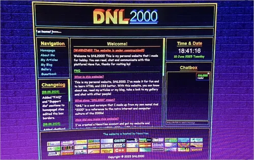
And when the summer began, I opened my laptop and created my first HTML page. I didn't exactly know how to write HTML, I just had a little experience where I used it to make some tables and stuff on offline few years ago. So, I had to search the internet to learn how to make the things that I wanted on my site. I also had to learn the basics of CSS to stylize it. I didn't know how to code JS and I actually didn't want to learn it at first. So I didn't use it, for then. After a few days, this was what I got (I don't have a screenshot, this image was taken with my phone.):

Image of my website's first layout

A three-column layout which has black-transparent gradient boxes with neon cyan-yellow borders, colorful texts are made with Arial and Comic Sans fonts, a blue-purple brick background. I've designed that 3D logo on the Microsoft PowerPoint, using WordArts. Now, honestly, I guess it wasn't terrible for a first layout from a newbie like me. I kinda liked it during the first few days... But yeah, it definitely had some issues. And I quickly got bored of it. First of all, my codes were an absolute disaster. I hadn't thought that every HTML element would be useful in the future and I gave them too much general CSS styling without knowing it. Which means, developing this layout in the future would suck. Second, the color scheme was too colorful and weird for me. I mean, it doesn't have a constant personality or feeling. It just felt like a goofy, energetic mixture. I wanted to make something that reminds me of 2000s, but this layout wasn't even looking like a retro site. It was just... weird... So, after a week, I decided to make a new layout.

But still, even though it's just been one year, this first layout kinda feels nostalgic, for some reason. I didn't even know how to center that logo back then!


My Second Layout:

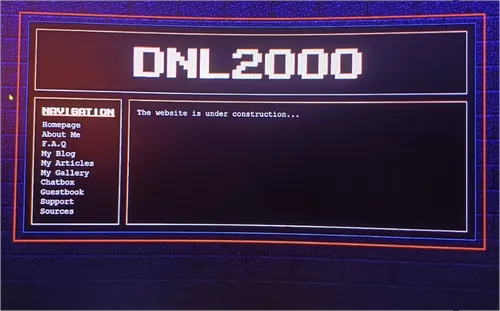
For the second layout, I've decided to change the color scheme a bit. I was partly inspired by feelingmachine.moe's layout in June 2025, 'cause it was one of the coolest layouts that I've ever seen on Neocities. Instead of using every high contrast color, I've decided to go with red, blue, black, white and a bit of green color palette. It was dark themed like the previous one. I also changed the main font to Courier New and a pixel font that I found from the internet. I wanted to make a bit more calm atmosphere. I've made solid black boxes, a bi-colored red-blue shadowing method and white-green bordered boxes for my two-column layout. And, well... This was what I got (It wasn't that empty, but just like previous one, I don't have a screenshot.):

Image of my website's second layout

It was somehow looking even worse than the previous layout. I've accidentally oversimplified it and I honestly really felt bored while making it. Like, this wasn't the thing I was imagining in my mind. And then, after a few days, I really felt bad, stressed and thought like:

"Oof... I can't make it look good! I don't know what to do!.. Screw it, I'm terrible at this. I guess designing and making something artistic isn't for me. And this was a complete waste of time. I don't ever wanna know this site is still existing. I'm gonna delete it."

And I did. And then, I felt uncomfortable. Why? 'cause I already spent two weeks for this thing! My time was lost forever. I couldn't forget this. I wanted to successfully finish the job that I started myself. Another problem is, I didn't even have better things to do. My summer vacation was getting wasted with nonsense stuff. I wanted to create, do something on my computer.

After deleting my site, I still hadn't quit Neocities. I looked around and other people's sites more. Tried to figure out something different in my mind from scratch. I've spent the whole week at the computer, trying to get inspired by many designs, including the video games' interfaces. After a break, I wanted to give myself and this site a second chance. I recreated my account. And then, made my third layout, "DESKTOP DNL2000!", in a few days.


My Third Layout:

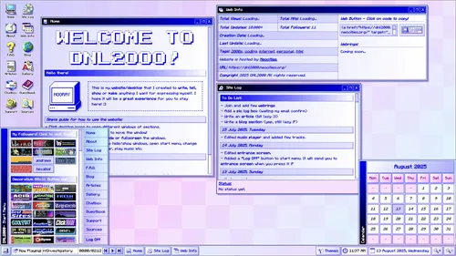
While browsing some site designs in the break, I really liked those desktop-style and interactive sites on Neocities. Like, draggable windows, a taskbar, many desktop icons that can open new windows. Everything was simply collected on a single page. And they were kinda fun to look at, it's like you have a mini computer interface in your computer, but it's completely designed by you! I was especially inspired by sites like lunospace, Lilith's Lair etc. Even inspired the theme from a kawai designed flash game "Sushi Cat 2". So, after a while, I've created a new color palette: The main colors were light blue, light cyan, light magenta and white. Font coloring, borders and shadows are made with navy, blue and black. I've also changed the font type to a font that is used in Minecraft, which is called Minecraftia. Because it was looking very cool and nostalgic, like those old LCD screen fonts from the past. And this time, I went with a light themed layout. Because dark theme was kinda hard to design. The colors should fit to the dark background and theme, otherwise it doesn't look like a cohesive whole. That's why I used light themed layouts in the past. It's easier to use any color you want. Anyways, after few days of writing and getting better at HTML and CSS, learning a bit of JS and jQueryUI to make that interactive layout, this was what I've got:

Image of my website's third layout

It definitely was a successful result for me. Everything looked very clear and it was definitely the thing in my mind. I've also made few pixel arts for the site, which made it look richer. And this was the time when I started to gain recognition in Neocities, even started to get my first positive feedbacks then. I went ahead with this layout for about a month. And finished most of the empty pages and unfinished stuff.

However, there were some stuff that made me uncomfortable recently then. First of all, this color scheme didn't feel right. Normally, I wanted a calmer and a bit more "melancholic" looking layout. Like, this is how I'm mostly feeling in real life and I wanted my design to reflect my personality. This bothered me, because even though I've made everything myself, it didn't feel like mine.

Second, there were some problems with using desktop layout. Like, code errors, non-responsive layout that is hard to use on mobile, no constant box aligning etc. And it would be hard to develop in the future.

Third, the site name. That's right, I didn't like my site name. Cause, it doesn't make sense in first look. Like, what would you think if you saw the name "DNL2000" for the first time? It looks like a random cryptic stuff. You have to learn the meaning from the webmaster, which I thought is kinda odd. So, I had to find a better name, too.

So, for these reasons, I planned to create more layouts, until I get satisfied with the results. And I've simply made five unsuccessful attempts. Most of them weren't even finished halfway and I've used them for only one or two weeks.


My Fourth Layout:

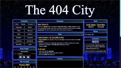
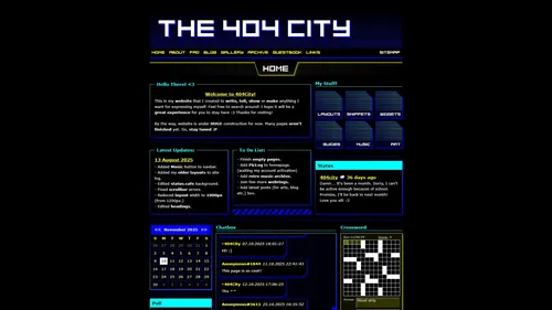
So, this layout was also where the name 404CITY was born. How did I find it? Well, I was actually inspired from a badly designed funny Amiga CDTV game called "The Town With No Name". Even though game itself is kinda weird and terrible, I loved the name of it. It kinda sounded "mysterious" and interesting for me. Like, a town, where no one knows where it started and where it will end. So anyway, I thought something like "The No Name City." for my site from this. The word "city" was sounding more modern, cooler and "dystopian". But "The No Name City" was kinda sounding too long. So, I thought a shorter name. And found "The 404 City". "404" was somehow making more sense, knowing that it will be used in a website's name. It was a reminder of every site's fate, including this one.

Anyway, for the layout, I made blue-cyan colored and neon light bordered boxes, used an animated pixel city background that I found from the internet, Times New Roman for the default font and banner. I went back to the dark theme again. Tried to give that "calm" and "melancholic" feeling again, like my unsuccessful attempt on my second layout. And this was the result:

Image of my website's fourth layout

Just like what happened in my second layout, I've never been able to finish this layout too, because I've basically oversimplified it, again. And I've decided to change my coloring method to overcome this problem. As I said before, designing a dark themed layout is harder than light theme, for me. So, even though I wanted to design a dark themed layout, I had to get my coloring and designing skills better by creating light themed layouts. And, that's how I've made my fifth layout.


My Fifth Layout:

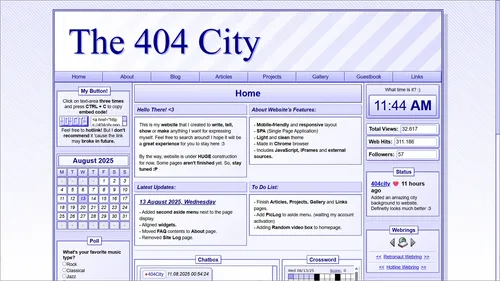
I don't exactly remember where I was inspired this from. Because that I wanted a light theme layout, I've decided to use some shading techniques like using gradients and shadows. So, I used white and light blue gradients for the main coloring and used navy to colorize borders and texts. I also decided to use Arial font for this job. It kinda looked more professional, cool and legible. I also learned how to make strip patterns using gradients and decided to use them on the decorations. I used double-sided sidebars for this layout and the main layout itself was a mixed-column layout. It was a good choice for creating a layout with variety. So, that was what I've got:

Image of my website's fifth layout

It wasn't bad though. It had a nice, clean and easy-to-use interface. But, yeah... like I've said before, I didn't want to use light theme colors for my site. So, that wasn't a very successful result for me. Another problem is, it kinda looked soulless. Y'know, the coloring. It kind of looks a bit, minimalistic. Like, it looks like it's owned by a boring company. I've decided to use more friendly colors next time on this layout. After a week of using this layout, I've made my sixth layout.


My Sixth Layout:

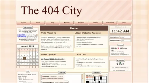
This layout was mostly same with the previous one. The only difference is the styling. I've inspired these colors from Nekoweb's (It's a static site hosting platform like Neocities, but newer.) own layout. I kinda liked the color palette which contains peach, cookie, beige, brown and skin colors. Looked very natural. I also changed the font type to Verdana from Arial. It looks more friendly. So anyway, that was the result:

Image of my website's sixth layout

The colors were cute and nice. But... Like I've said before, light theme wasn't very fitting to this site. Another problem is, the site name "404CITY" wouldn't even remind me of this type of colored layout. It was too, um... what's the word... Joyful and positive, I guess. That wasn't the feeling I wanted to reflect. So anyway, because of this, I wanted to stick to my previous layout's color palette and design, again, but wanted simplify a bit more. Maybe I could've find a better version of it. And made my eighth layout.


My Seventh Layout:

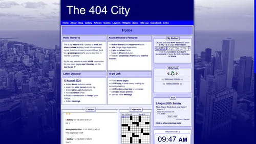
For this one, I've inspired a bit from a media platform SpaceHey's layout (mostly header and navbar style) and some of the Nekoweb sites, especially joo.sh's white-navy blue combined cool site. So, I tried to make this layout's width a bit shrink too. Wide layouts are kind of, looked ugly for me. I wanted to squeeze the content to make it reach on eye level. I also decided to use a city background that I found from the internet for this one 'cause, y'know, site name is 404-CITY? So, that was the result:

Image of my website's seventh layout

I don't have to repeat it. It looked soulless and boring again and maybe even a bit worse than my fifth layout. And honestly, I was slowly getting burn-out. It was August. I spent two months to find the correct layout for me. But it was exhausting and stressing. Because I wanted to finish my job before summer ends. If you've read my about page, you already know that I'm studying at boarding school. I couldn't make updations while I was busy there, I don't even have a laptop with me there too. I couldn't borrow it from home too, otherwise I know I won't be able to concentrate to my lessons, while I have a computer with me. So, for this reason, I've decided to take a break for about two weeks. Getting away from the website and make a better plan from my mind. After a while, I've tried to design some dark-themed layouts from my computer offline too. Unfortunately, they were mostly unsuccessful. But I didn't wanted to leave this site with a light-themed layout. I really wanted to create that calm and melancholic feeling. So, I really had no other idea than creating this layout:


My Eighth Layout:

This layout was very oversimplified. I already had a pain with creating dark themes. I was inspired by a site Corq's Portal, 'cause it was one of the coolest high-contrast dark theme layouts that I've seen on Neocities. I tried my best to create something unique and cool by getting inspired without fully copying it, but I've failed. I couldn't make it look good. So, instead of making another unsuccessful attempt, I've decided to make a simple layout and leave it for few months until I get back home and then could think about creating another one. I simply used black background and high contrast colors like cyan, blue, yellow and white. Most of the pages are already empty and I didn't have enough time to complete them. So, this was the result:

Image of my website's eighth layout

Like I said, it was too simple. I don't have much to say about it. There was a few days to my summer vacation to end and I didn't have any other choice than leaving it like this. I spent the whole summer while getting busy on the computer and I haven't still found the layout that I wanted yet.


My Ninth Layout:

While I was at school, I thought about what to do about this layout. I had bunch of cool ideas to make but, I wasn't exactly sure about what to create and might've end with another disaster. So, I had to wait and take a break until finding my layout.

One day, at the weekend, I've visited my family back again like regularly I do. I still had no idea to what to create and just, felt bored about the situation. I turned on my computer, then opened my third layout on the offline editor. Why the third? Because it was the longest one I've used, had fun while making it and it was the most successful attempt I've made. Not only that, I realized something important too: It's much better to make your own than getting too much inspiration from other people. Otherwise, you just get slowly bored of your layout, it feels like it's not yours. So I choose my third layout as a success, 'cause it was also very original and unique, for me. I looked at my layout for a few minutes. And started thinking:

"Hm... The problem about this layout is its color scheme, right?.. The layout itself isn't looking bad at all. So... what if I change the color scheme to get the thing I want? Couldn't it work?"

So, I opened the DevTools. And started to apply bunch of CSS filters to my layout. I've tried many kind of combinations, until finding the dark layout and color scheme that I want. I've played with the colors, saturation, contrast, brightness, sepia and invert effects... And the one that I tried:

html { filter: sepia(1) invert(1) brightness(2) contrast(4); }

This thing, basically created the demo of the current layout that you're seeing right now:

Image of filtered version of my website's third layout

It was perfect. I literally liked every detail of it. Pixel-perfect, White bright borders, headings, texts... And the blue shadows are added a nice neon effect without any blurry look... Navy-black gradient backgrounds and boxes... everything was looking so obvious. A high contrast, blue-white neon colored, dark theme layout. The white and black colors make a high contrast each other, while the blue (RGB(0,0,255)) adds a depth, energy and feeling to it. And the pixel fonts that still giving a better retro feeling... This was it! I finally found the layout that I wanted.

Not only that, to even make sure that this CSS Filter does look good on mamy designs, I opened the Neocities and applied this filter to a bunch of sites with using DevTools. And it really looked good on them too. So, I've decided to go with this color scheme and design. Pixel-perfect double borders, window designed boxes, gradient-based headings, a nice white pixel font, a color scheme that made with 4 different high contrast colors: White, black, blue and cyan. I've decided to not use yellow and red details this time, like I've used in my eighth and fourth layouts. They kinda made them look ugly. I've decided to stick to this palette that contains cold, bluish and high contrast colors.

However, because it was the weekend, I didn't have enough time to start to make this layout. So, I've decided to wait for the school mid-term break. I could've easily finished this in one week vacation.

In November, when the vacation started and went home back again, I immediately opened my laptop and started to create the layout that I wanted to make. I don't have the first version's image right now, but this is one of the early ones in January 2026:

Image of my website's early ninth layout

I already explained why I used this color scheme and styling. But the difference from the third layout is, it's not desktop designed. I also tried to use a iFrame based SPA-like (Single Page Application) page system for this layout. Normally, I used Javascript based SPA-like page system in my previous layouts to make the HTML part easier. So I wanted to use the iFrame method this time to try to make it easier to code. But when I did, I realized it was kind of hard and inefficient to develop. You know, working with the CSS and JS became inconvenient. And it wasn't SEO optimized. So instead, I've decided to use MPA (Multi Page Application) and it definitely worked a lot better.

I also used this second layout for the widgets page too, because the widgets were looking very simple and independent from site and I decided to make a simple and clean layout for them:

Image of my website's old widget layout

But after a few months, I removed it and instead, used CSS filters to make it look more fitting to original site layout. It was a bit hard to develop two layouts at the same time. I wanted to make site look a cohesive whole.

So anyway, I updated the main layout's look many times, like changing the backgrounds, styling effects etc. But the main idea is still the same. I also changed the font type too. Minecraftia was looking cool, but the problem is, it has subpixel-rendering issues when it's used in 16px. This caused to make the font look a bit blurry, because Minecraftia is normally designed for 20px font size and it's multiples. I've tried so hard to fix this issue a long time ago, but, physically it was impossible, because that was simply how computer screen pixel ratios were designed. So instead, to make a much better pixel-perfect look, I used some DOS fonts that I found from the internet, but they kinda looked ugly for me, so I've decided to create my own pixel fonts in the BitFontMaker2. And it worked very well.

So, at the end, I'm still using this ninth and latest layout. And I still love it and don't have any future plans to change it again. I'd love to be remembered with this layout in Neocities. It was hard to find a site design that satisfies me, and I'm glad that I finally made it. Now what I'm doing is, basically slowly filling it with the content that I make and wanna share. And there are still a lot of plans in my mind, and I'll keep bringing them to this site. Right now, I'm designing fonts, widgets and layouts and write some snippets and guides to help to the indie web community grow faster, write the things I wanna share with you on the blog page, fill my gallery with the images that I'd like to share. I also have plans to open my Projects page and share my software-stuff with you. Would love to learn JS better.

I also have to say, I really love and have huge respect for platforms like Neocities, where they truly care about their users and help the indie web grow. And I'm definitely thinking about upgrading my account to Supporter in the future, once I graduate from high school, get a job and start earning my own money.
Conclusion

Phew! That's all. This entry was kinda hard to write. Took a few days. Mostly because of laziness, but I really wanted to write this entry to tell you how I've made this site the story behind it. So maybe, it can inspire you too? I don't know. Anyhow, I hope you didn't get bored while reading it. Also sorry for my poor English and grammar. I'm trying my best to express myself and be sincere. Still, I think it's much better than the previous, deleted blog entry.

Take care and good luck in life!
And good luck with your website layout!


Click To Go Back To The Blog Page